

I am so glad you're here! This is my little corner where I get to share some of my most favorite images from engagements, weddings, births, my travels and my own little family from time to time. Hang out, look around, and please reach out to say hello!
explore:
welcome to my
home on the web
Weddings
births
Engagements
Families
Oh my goodness, I’m so excited! And so relieved to be done :-) I love my new website and I really hope you guys do too! I gave my site a pretty good facelift last spring when I updated my logo (to include my signature) and branding (to look a little more sophisticated), but it still wasn’t exactly where I wanted it to be. So last fall, I started dreaming and looking around and trying to decide what to do.
I’ve mentioned it before, but I love my website company, Showit. It’s not just a website company but it’s kind of like a family. And I love having that community that is literally all over the globe! And when it comes to actually designing my site, I have 100% freedom to do whatever I do with it. The trouble is… I’m not a designer. SO many times I’ve wished God had given me design talent. It would be amazing to be able to couple that with photography! But, lucky for me, since I don’t have those abilities (as you can see in the screenshots of my old site below…), I’m able to use style groups that allow me to adjust (or flat out change) anything I’d like from the colors to the layout to the font, etc.. With a template, you’re locked in to what you’re given. But with a style group, it’s more like a jumping off point. My new site began with a style group that was designed by Promise Tangeman that I purchased it from her Sitehouse website just after Christmas. She was having a sale to make room for some newer designs so I snatched one up. Go take a look… she’s crazy talented!! And after the last few weeks of living inside of Showit, I feel like my site really looks like me and that it fits what Ben and I do!
Katelyn James talked about her design process on her blog for her mini-rebarand a couple of weeks ago. With it, she had screenshots of some steps she went through and how she landed where she did (and her site is SO HER! I love it). So, I thought it would be fun to take you through the progression of my site. I didn’t really have a design process because… well, I just jumped in without putting anything on paper. So, below is a progression of the website over the last several years.
I’d love to hear what you guys think! You know I love comments on the blog, but you can now leave comments right on my website! Just click on the Comment link at the top of the page and voila! Comment box at your disposal :-)
This was my second go at my website… and I loved the stripes! But they were a bit much as a full background.
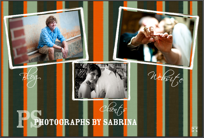
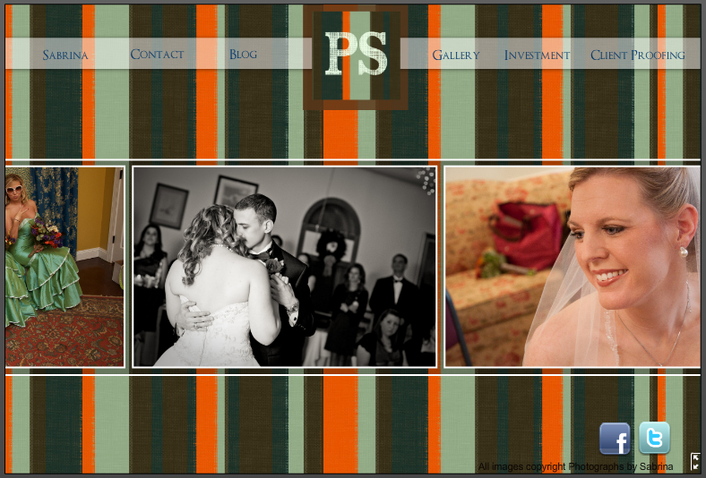
This was the home page with the new scrolling gallery!
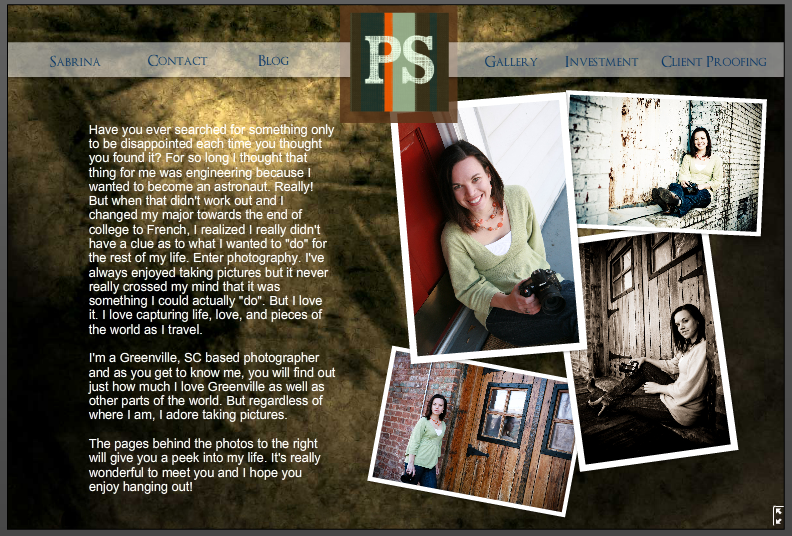
And then there was my About Me page… that looked nothing like the rest of my website. It was scary.
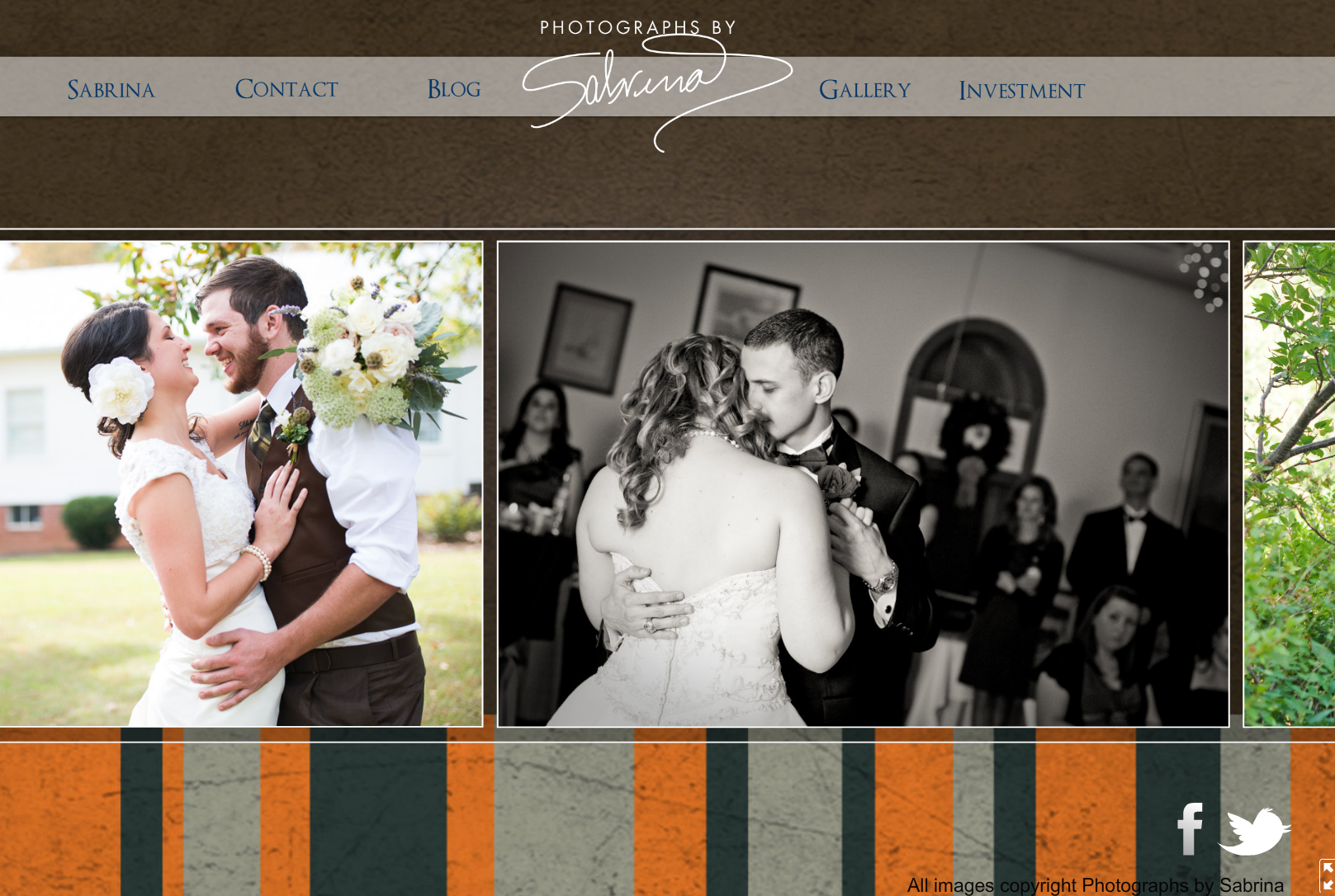
 So then, last spring, just after wedding season had started, I realized the website needed a much needed facelift. And thanks to my good friend Chris Turner’s mad design skills, the website looked more sophisticated with just a few clicks!
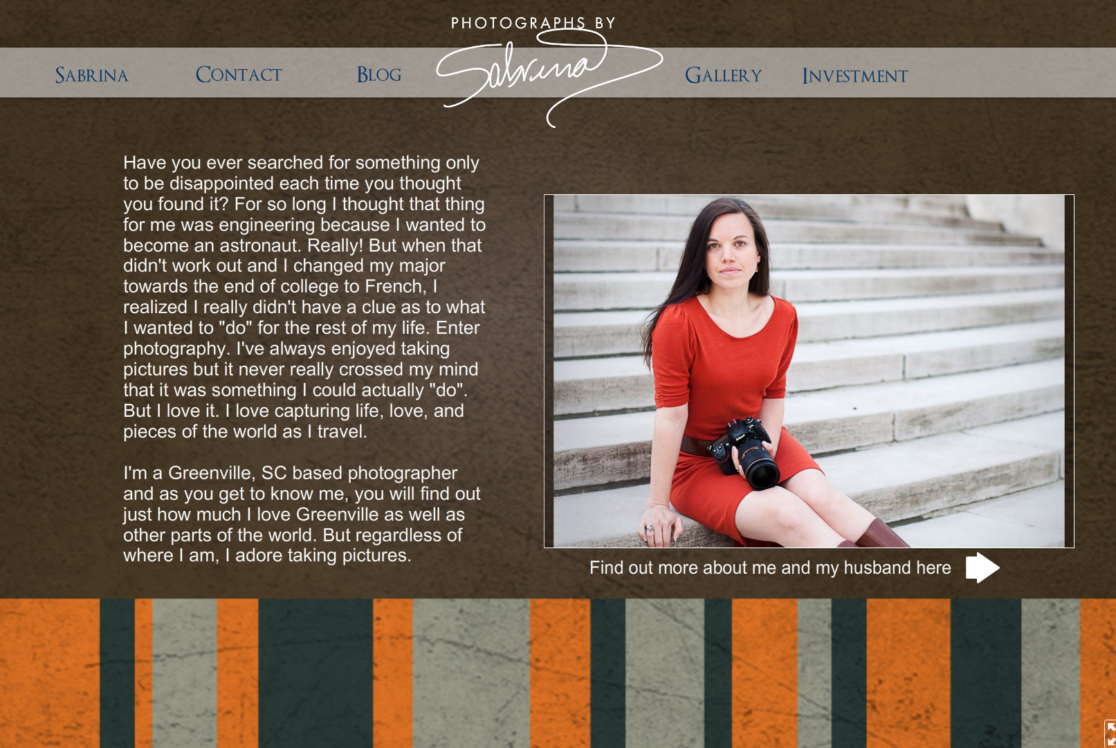
The About page was better but still not great! Ben had just taken some new head shots for me so those along with some of our wedding pictures were added in too.
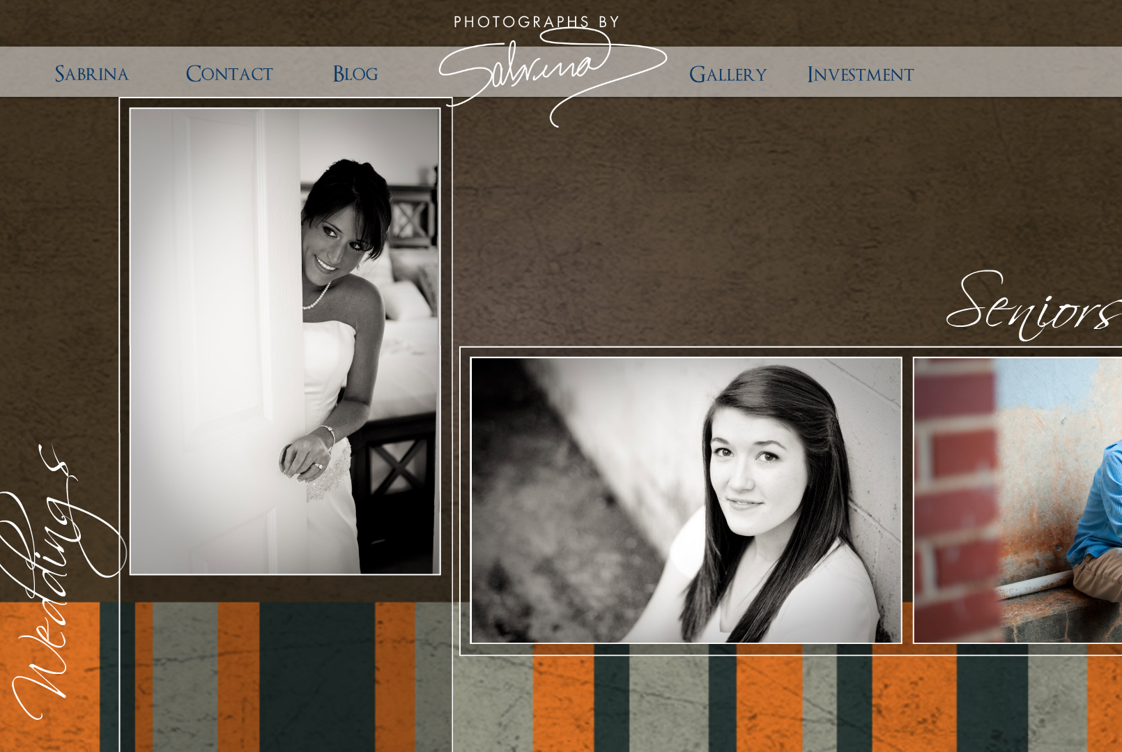
 The Gallery page matched the rest of the site, but I wasn’t crazy about it.. A couple of years ago, I tried to specialize in just weddings and high school seniors.
But I soon realized I still loved capturing all of life! For some reason though, I just couldn’t find the time to update and expand this page.
So… after all of that… welcome the new website for 2013! It feels better, looks better, and just FLOWS better (and doesn’t have 5 different fonts!)!
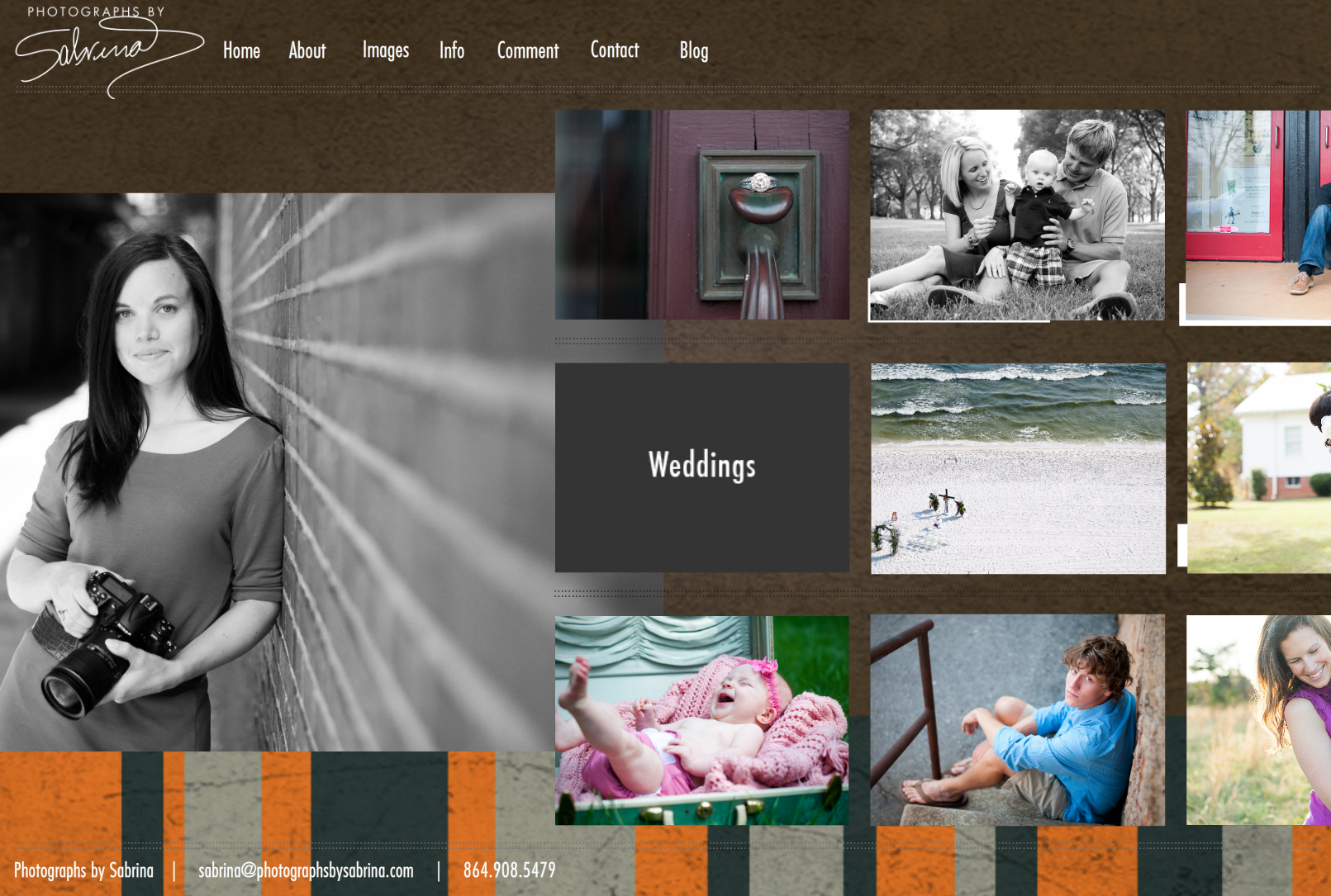
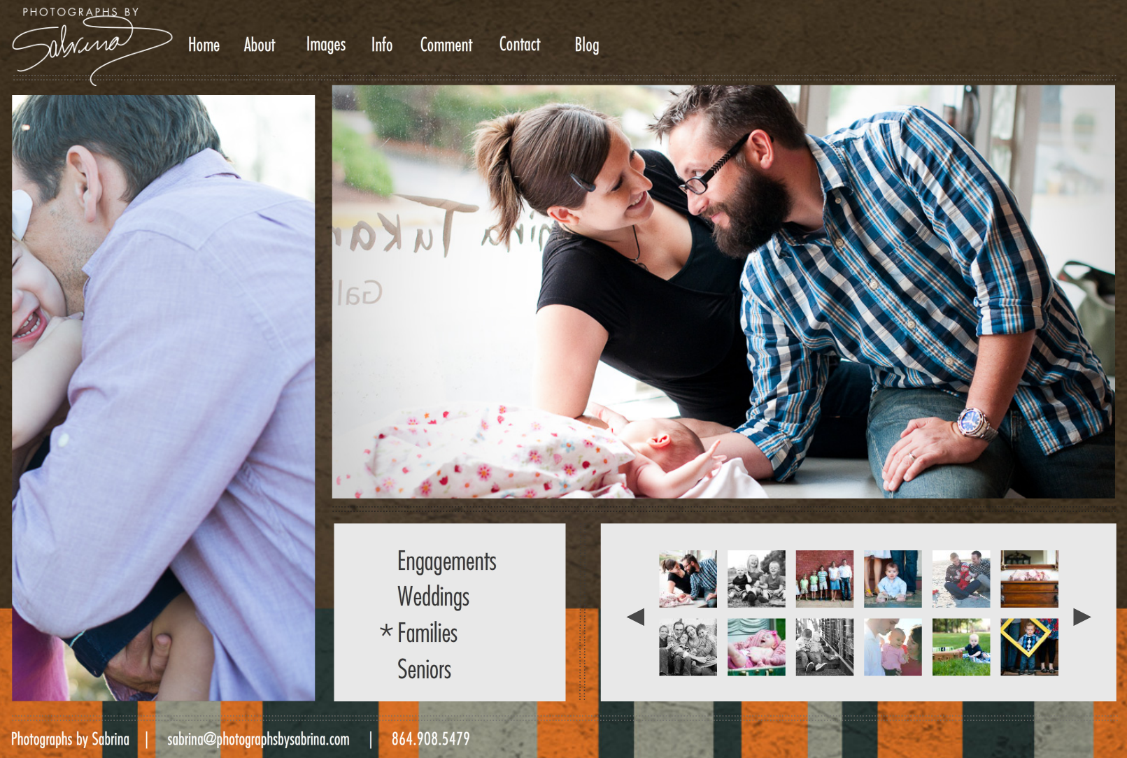
The Home Page gives you a quick glimpse of everything. And some of the tiles on the right flash as links to the different galleries.
The About page might be one of my favorites! The images in the center link to info about me, Ben, and the both of us!
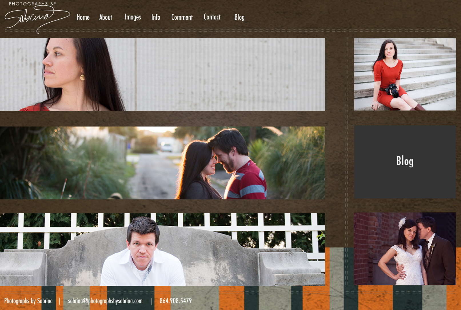
Then, the tiles on the right link to my Twitter, Blog, and Facebook pages.
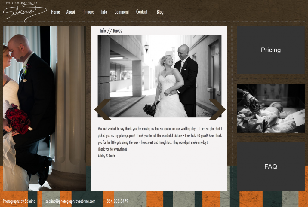
Under the Info link at the top, you’ll find all kinds of stuff – so be sure to click on those tiles and look around!
And finally… the galleries! They’re just so pretty. And I’m so excited to have the options and room now to add more images as the year goes on!
Be sure to hop over and check out the new photographsbysabrina.com!
Happy Tuesday, everyone!
This is Spectacular Girl! its going to be so fun to look through all of your beautiful photographs with these updates on the website
This is great! I love seeing your progression and the new About Me page is kick butt!